City of Offenbach am Main
Brand design and umbrella branding for the “Arrival City” in Hesse



Project description:
A good start & meeting point
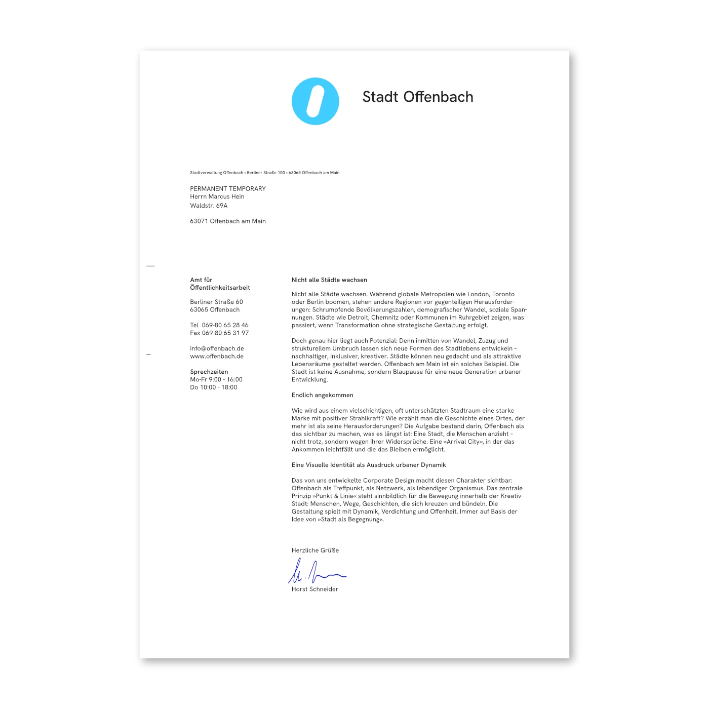
While global metropolises like London, Toronto, or Berlin are booming, other regions face the opposite challenges: declining populations, demographic shifts, and social tensions. Cities like Detroit, Chemnitz, or municipalities in Germany’s Ruhr area show what happens when transformation occurs without strategic design. But this is also where the potential lies. In the midst of change, migration, and structural upheaval, new forms of urban life can emerge – more sustainable, more inclusive, more creative. Cities can be reimagined and shaped as attractive living environments. Offenbach is one such example. The city is not an exception but a blueprint for a new generation of urban development.
Finally Arrived
How does a multifaceted and often underestimated urban space become a strong brand with positive appeal? How do you tell the story of a place that is more than its challenges? The task was to make Offenbach visible for what it already is: a city that attracts people – not in spite of, but because of its contradictions. An »Arrival City« that makes it easy to arrive and possible to stay.
Strategy & Positioning
Our strategic approach was based on the idea of the city as a social space. We understand Offenbach as a connected city – a network of people, stories, and movements. The densely situated University of Art and Design, the creative scene, international craftspeople, urban infrastructure, and affordable spaces for new businesses: together they form the DNA of this vibrant city. The positioning of »Arrival City« became the narrative and visual anchor: Offenbach is not just a place, it’s a beginning. A system of opportunity – enabled by location, accessibility, affordable housing, cultural density, and social openness.
A Visual Identity as an Expression of Urban Dynamism
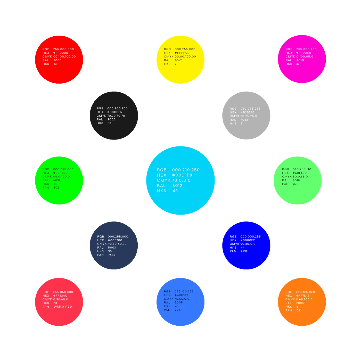
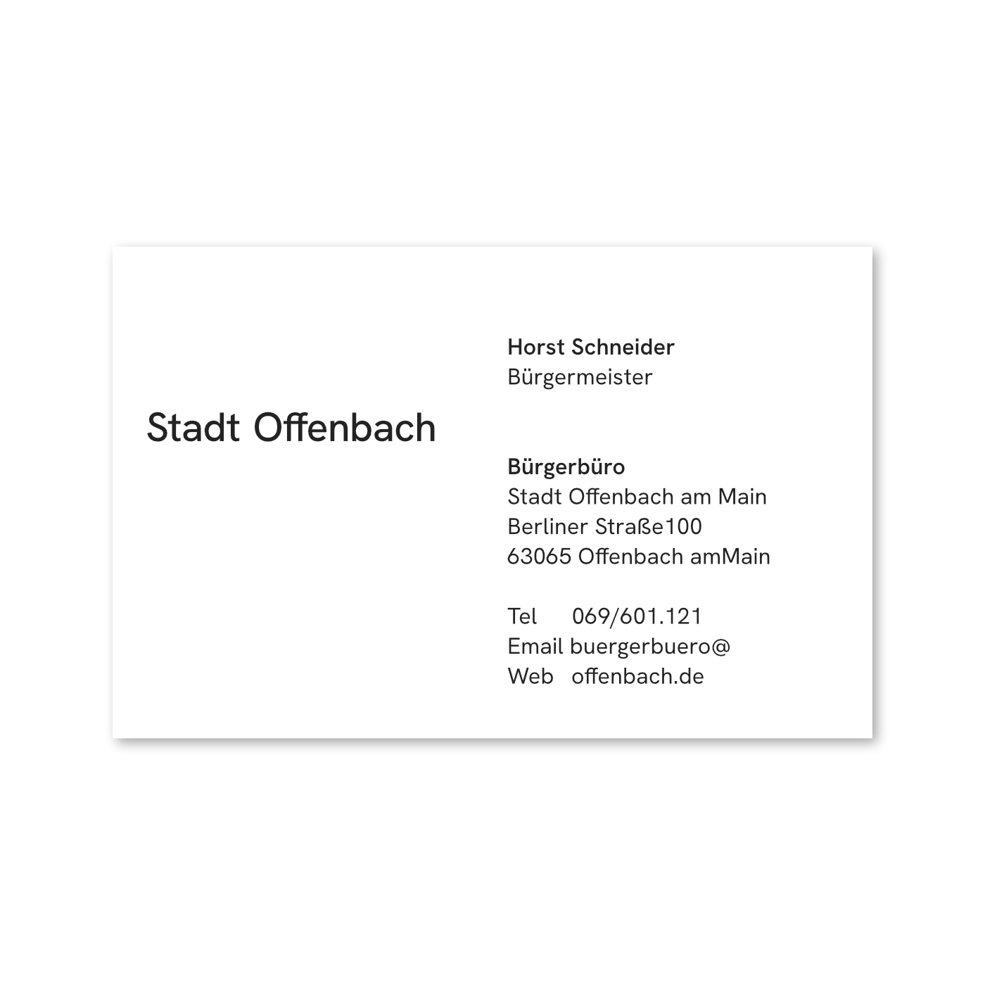
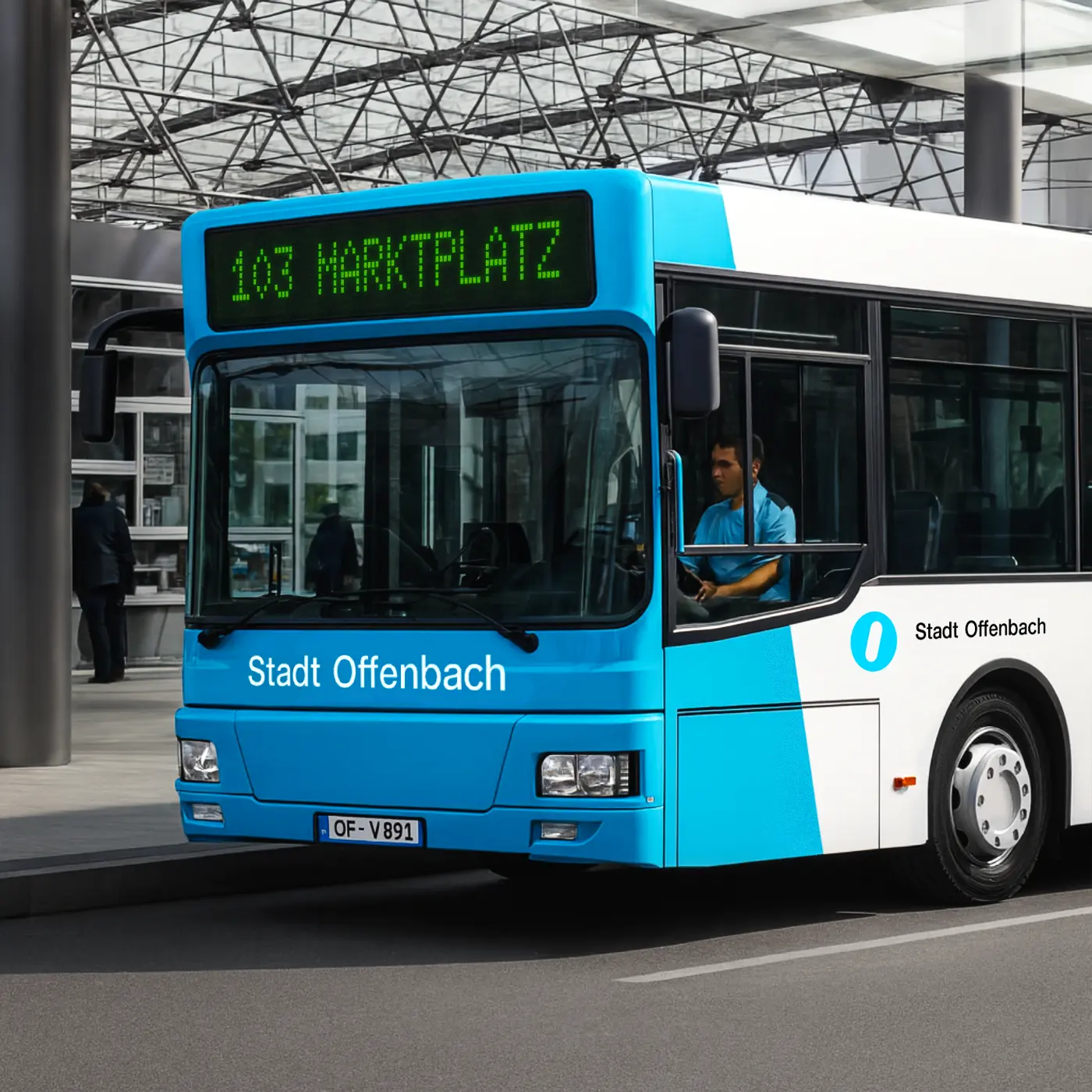
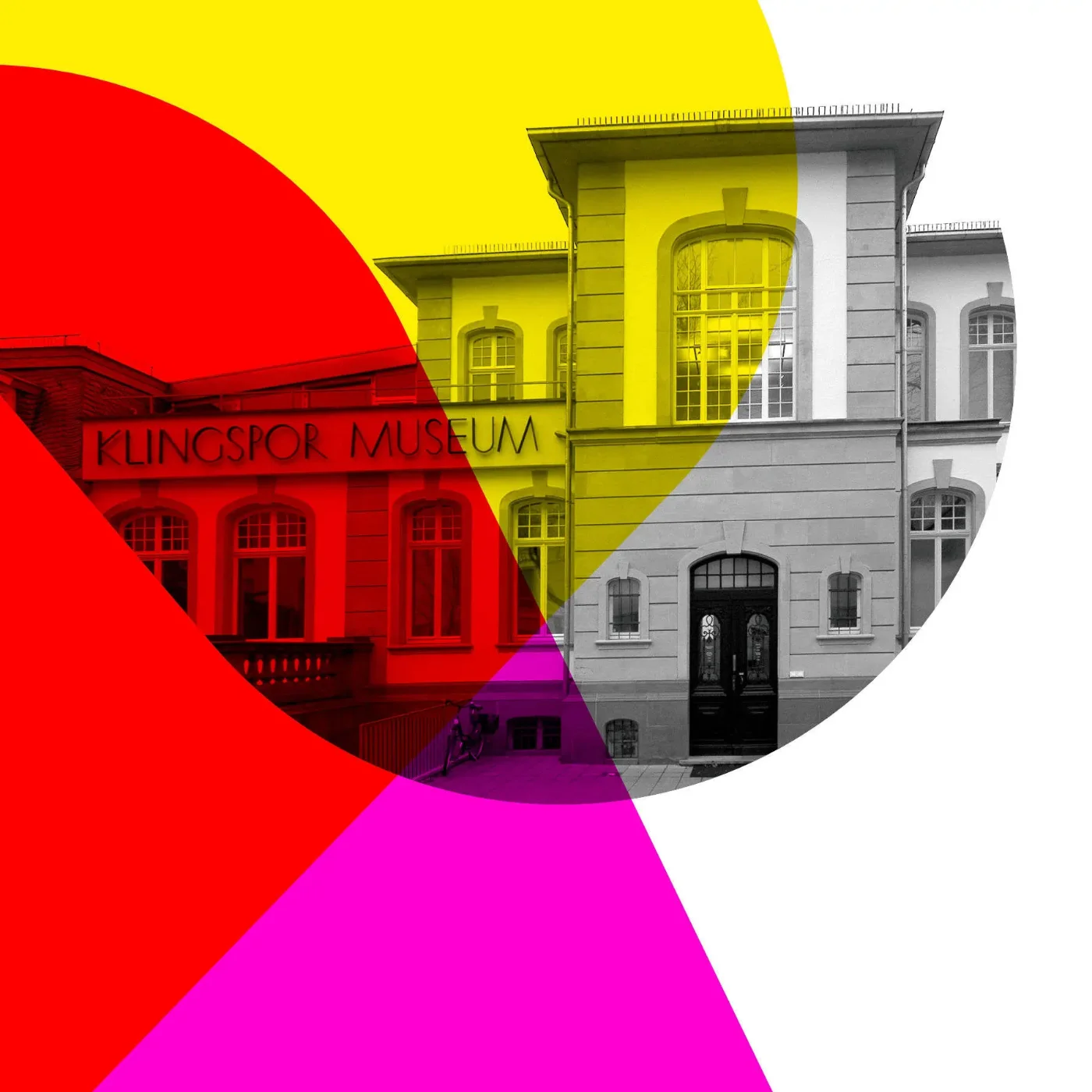
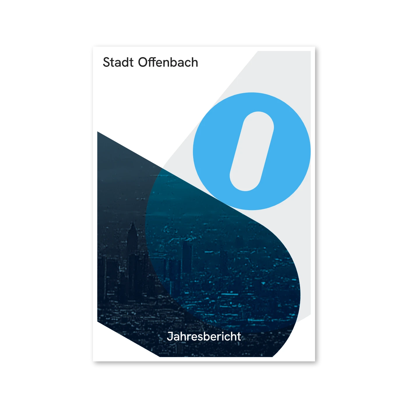
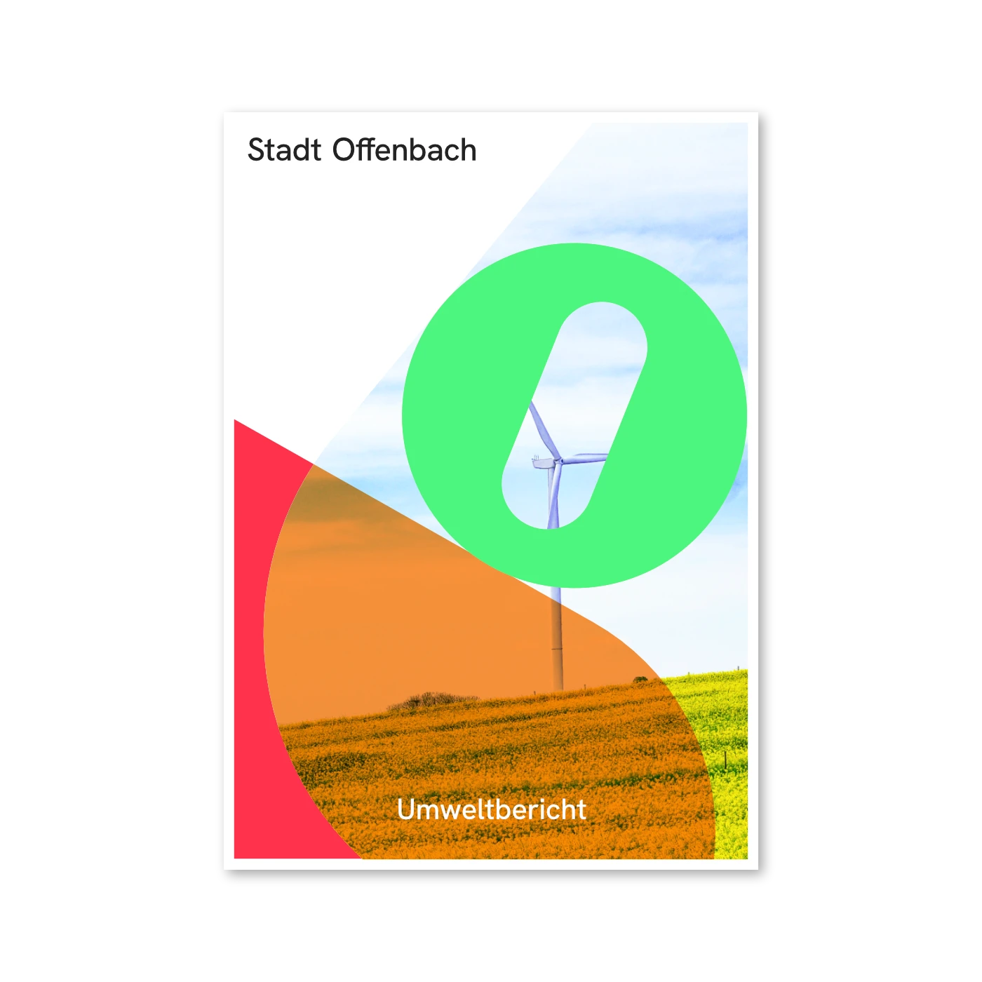
The corporate design we created makes this character visible: Offenbach as a meeting point, a network, a living organism. The central principle of »Dot & Line« serves as a metaphor for movement within the city: people, paths, and stories intersecting and converging. The design plays with rhythm, density, and openness – always rooted in the idea of the city as a space of encounter. This gives Offenbach a strong umbrella brand that doesn’t rely on image, but on attitude. A brand that sees transformation not as a crisis, but as part of its identity. It unites individual departments and sub-brands under a shared framework – without losing relevance or impact.
Offenbach is not a city reinventing itself – it’s a city making itself visible and unmistakable. With a fresh design that conveys emotion through conviction.
Client
Stadt Offenbach am Main
Project Board
Marcus Hein, Design & Art Direction
Development
Corporate Design, Visual Strategy, Branding, Art Direction, Design Direction