Fischer Smits & Collegen
Brand design for a real estate developer hits a clear market position

Project description:
Authenticity as the Foundation of a Distinctive Brand
Fischer Smits focuses on the development of residential properties. For each location, they seek tailored solutions with a strong emphasis on integrating each project seamlessly into its urban surroundings. The company acquires land, coordinates planning, and constructs residential buildings, primarily in collaboration with regional partners.
A visual identity was developed for Fischer Smits & Coll. that reflects both the architectural ambition and the values-based approach of the company. The new corporate design combines clarity, structure, and regional anchoring into a strong and consistent brand presence across all media.
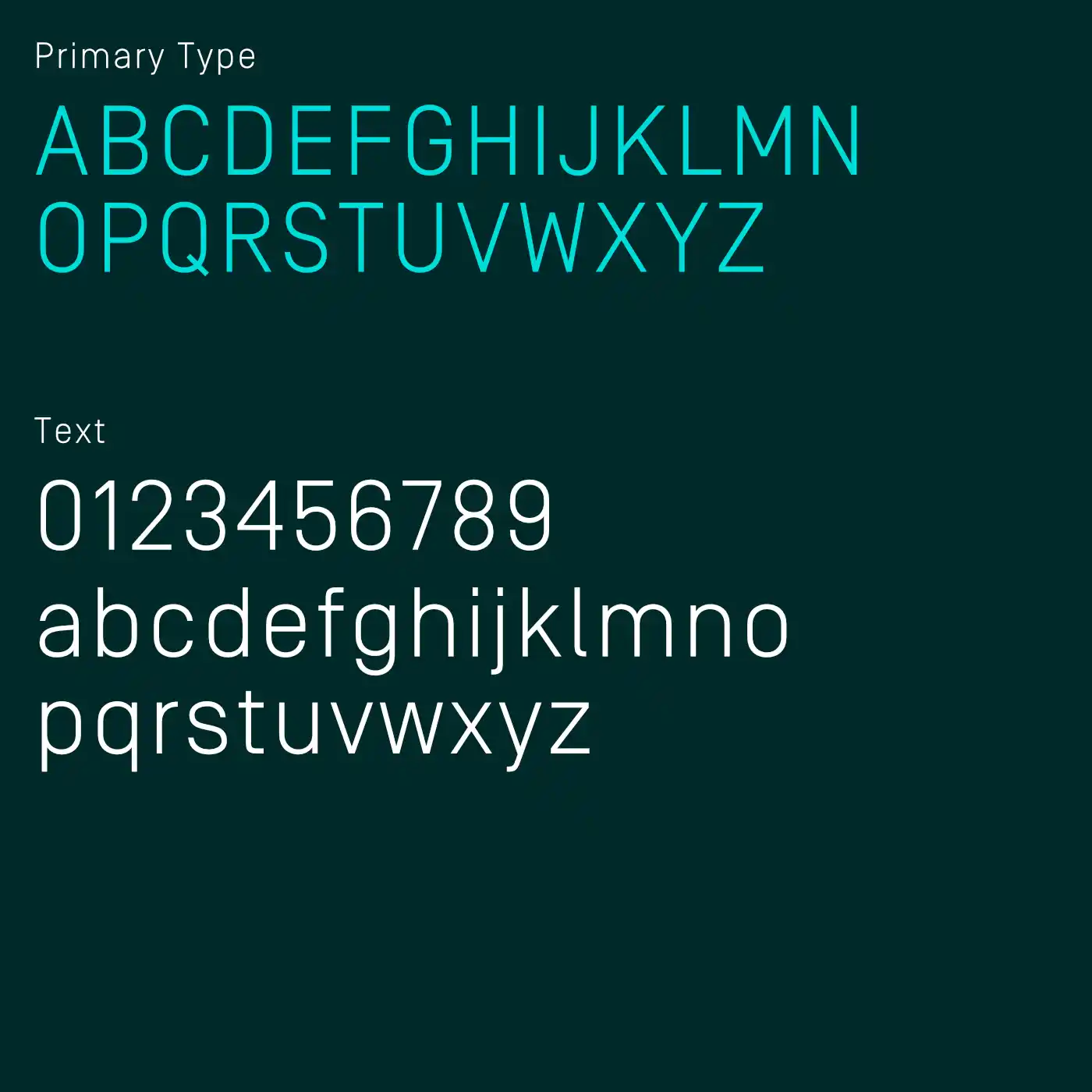
A reduced typographic style, carefully balanced color palettes, and authentic imagery create trust and continuity. The design communicates the company’s commitment to responsible development that is precise, locally rooted, and forward-looking.
Gaining Attention through attitude
The new visual identity and corporate design were created in close collaboration with the two founders to make the brand more agile and easier to use.
Redesigning the wordmark was the first step. It emphasized collaboration, improved usability, enhanced legibility, and simplified the overall design. This brings real energy to the brand and makes it tangible.
In a landscape of visual sameness, we wanted to do more than simply choose a color. A competitive analysis led to the development of a color system that deliberately creates contrast. It is clear, distinctive, and digitally optimized. The new combination sets the brand apart in its industry and gives it character, recognition, and relevance.
The new visual language creates unity and leaves a strong and outstanding impression.
The result is a clear and contemporary statement that creates a noticeable distinction in a competitive market of property developers.
The brand not only becomes visible but desirable. It attracts talent that identifies with its values and presentation.
No Filters – Just Real Connection
The visual language aligns with the company’s philosophy: understated, focused, and concentrated on what matters.
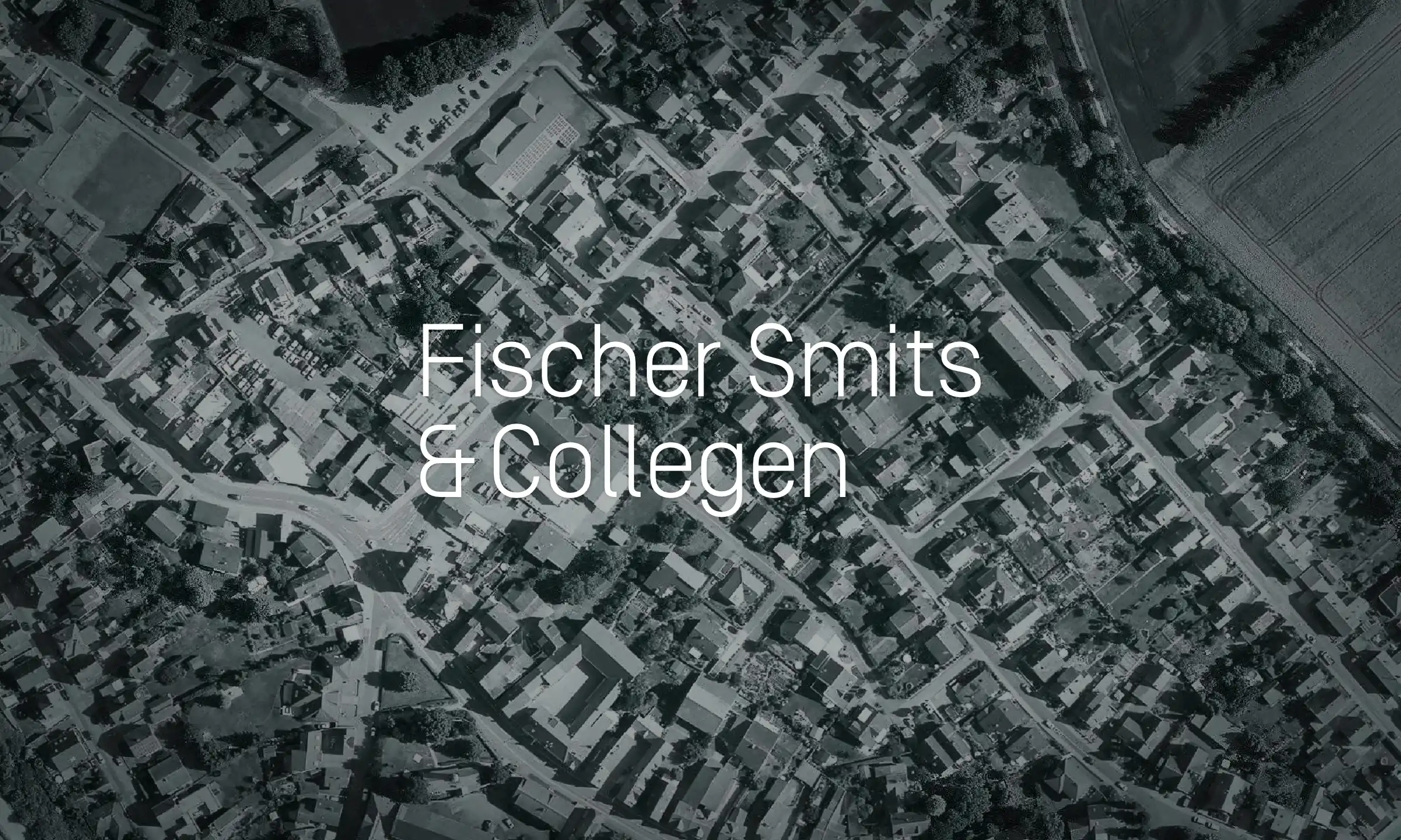
Instead of polished staging, the imagery showcases real places and authentic interactions with a strong sense for light, space, and proportion.
The photography avoids exaggeration and embraces a calm and factual aesthetic. People behind the projects are portrayed with the same level of care – approachable, genuine, and respectful.
This results in a visual language that builds trust and communicates the core values of Fischer Smits: quality, commitment, and a strong regional identity.
Digital Clarity
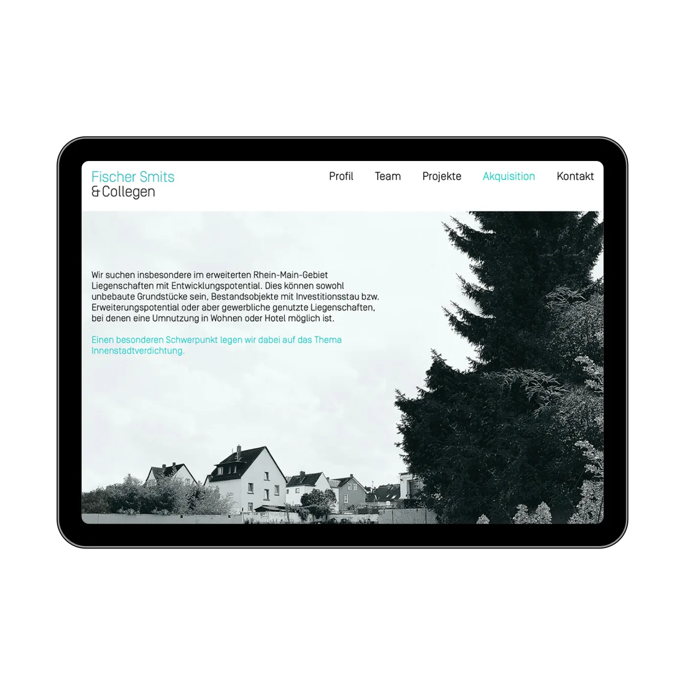
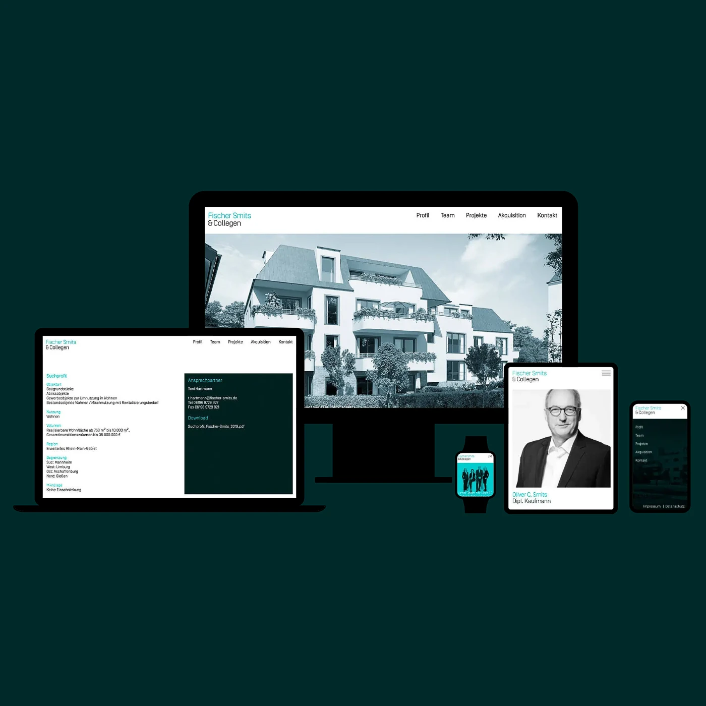
The Fischer Smits & Coll. website consistently translates the corporate design into the digital realm. It is fully responsive and offers an intuitive, calm user experience across all devices.
Refined typography, purposeful use of white space, and the brand’s distinctive color palette define the visual appearance. The imagery integrates seamlessly into the clear and structured layout.
The digital presence conveys competence without demanding attention.
Client
Fischer Smits & Coll. GmbH
Project Board
Juliane Fischer, Managing Director
Marcus Hein, Design Direction
Development
Brand Identity, Corporate Design, Branding, Art Direction, Editorial Design, Digital Publishing, Brand-Photography, Web-Design, App-Development
Photography
Katrin Binner