Anhalt University - FB3
A clean corporate identity for the architecture faculty at the Bauhaus Campus


Project description:
Three into One – The Merger at Anhalt University
Department 3 at Anhalt University of Applied Sciences unites three distinct fields of study: Architecture, Facility Management, and Geoinformation at a location rich in tradition: the Bauhaus Campus in Dessau. Situated near one of the most influential places in design history, the department itself was also meant to grow closer: visually and structurally, both internally and externally.
The goal was to make the interdisciplinary character of teaching more visible and to position the entire department as a strong, interconnected unit. A new visual identity was needed – one that reflects both the unity of the three disciplines and their proximity to the Bauhaus spirit: clear, minimal, and contemporary.
In collaboration with the department, we developed a visual system that not only strengthens formal cohesion but also communicates a strategic brand message: Three disciplines. One attitude. A shared presence.
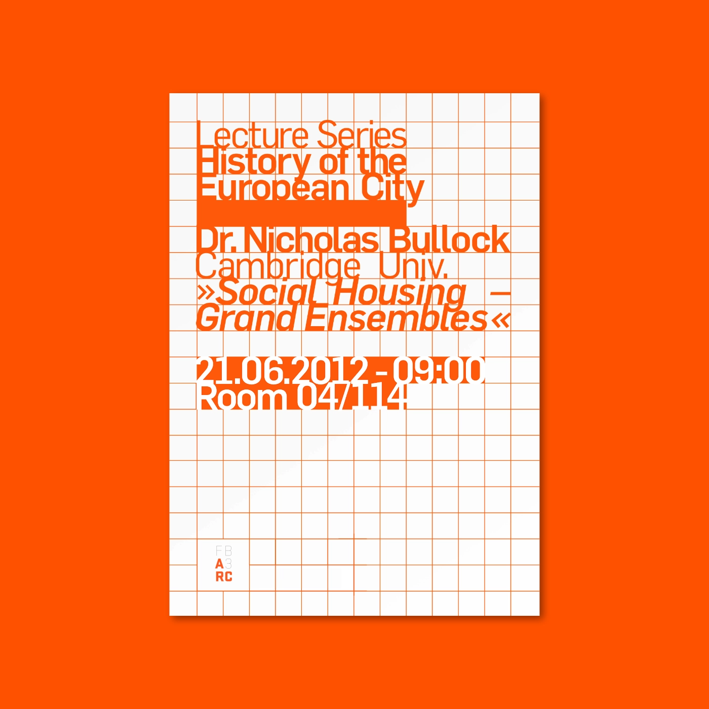
The new corporate design translates the idea of fusion into a visual language based on reduction, modularity, and clarity. The design system avoids illustrative or symbolic elements and instead relies on a graphically precise combination of typography, color, and space.
This way, belonging isn’t explained, it’s made consistently visible. The modular typographic system of the wordmark creates clarity, recognition, and distinction.
A consistent umbrella brand system unites the diversity of programs and institutes under one shared identity while still allowing for individual expression.
A clear and consistent typeface is a key component of AFG’s communication. The new typeface, Stratum, a geometric grotesque, is intended for use across web and print media.
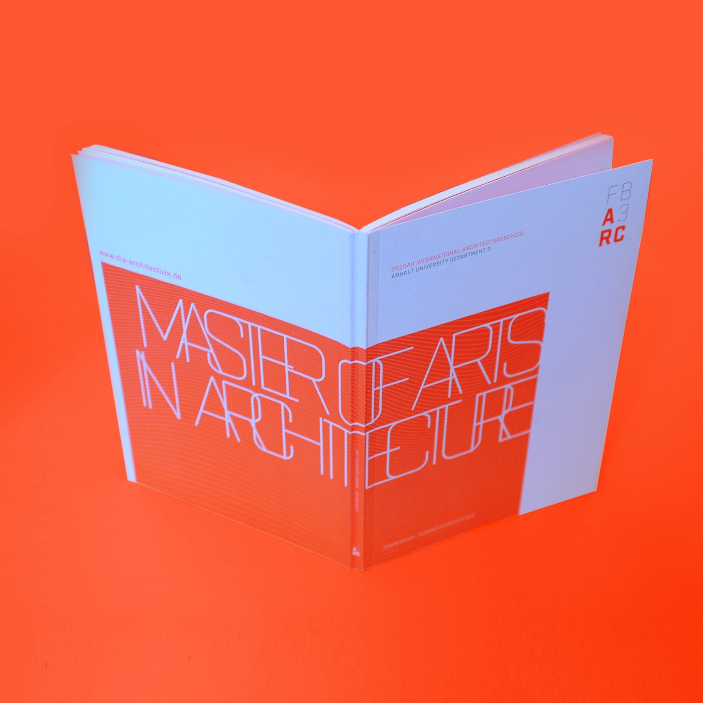
The editorial design is playful and experimental. It uses creative freedom to bring content to life in engaging ways.
The color system also follows a modular principle: the primary color for the department and its institutions is a soft gray. Each program is assigned its own secondary color.
The result is a visual identity that communicates attitude. It positions the campus confidently in the academic competition for visibility, trust, and future talent. At the same time, it allows room for individual expression and remains flexible in its application.
Client
Anhalt University - FB3
Prof. A. Teichert (Dekan)
Project Management
Prof. S. Pinkau (Coordinator), HSA FB3
Marcus Hein (Concept & Design)
Development
Corporate Design, Web Design, Editorial Design