Jewish Community Offenbach
New corporate identity building on Jewish traditions

Project description:
David is lived in Offenbach
Based on the initial situation and due to technological changes, a new responsive design concept and corporate design had to be developed to adapt to modern devices.
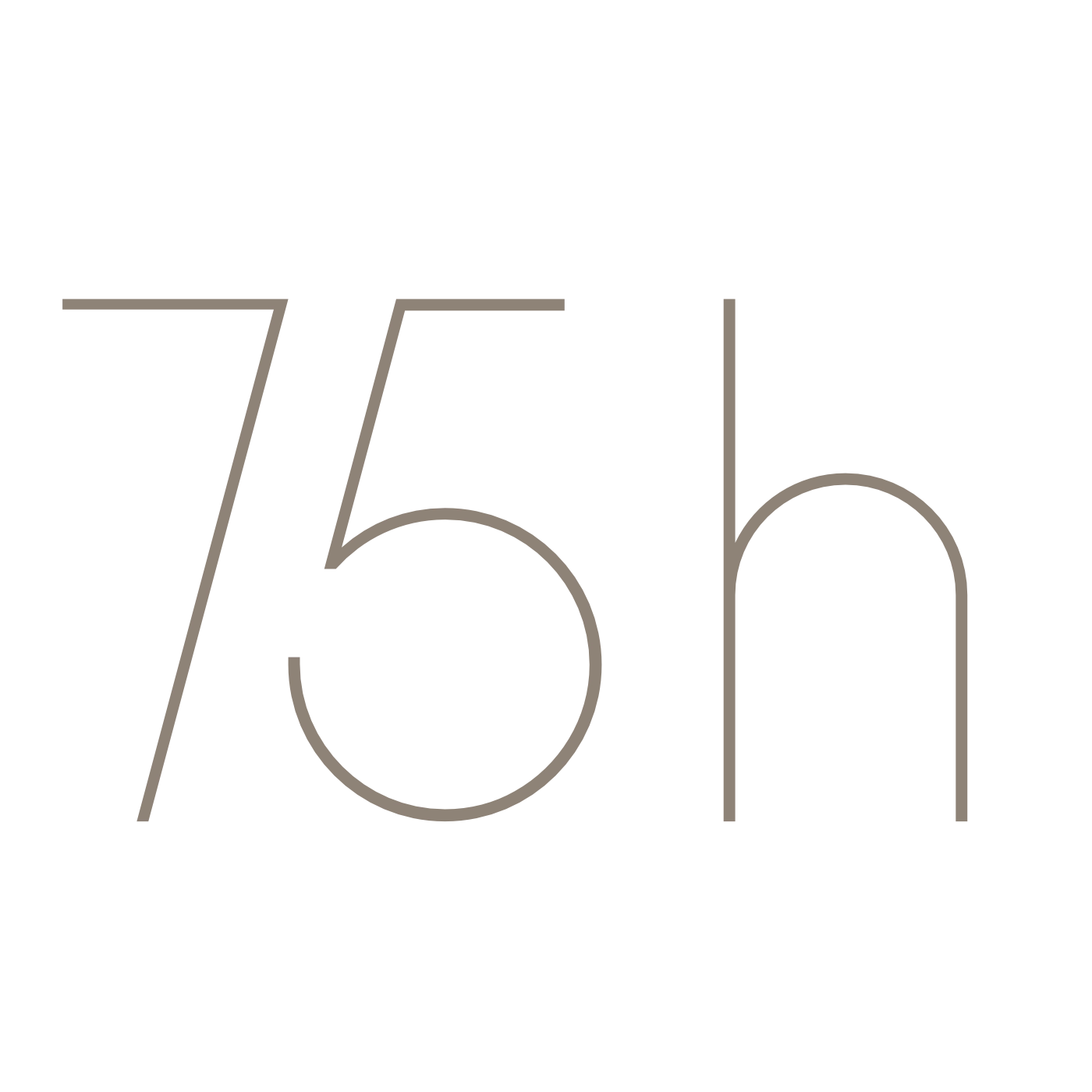
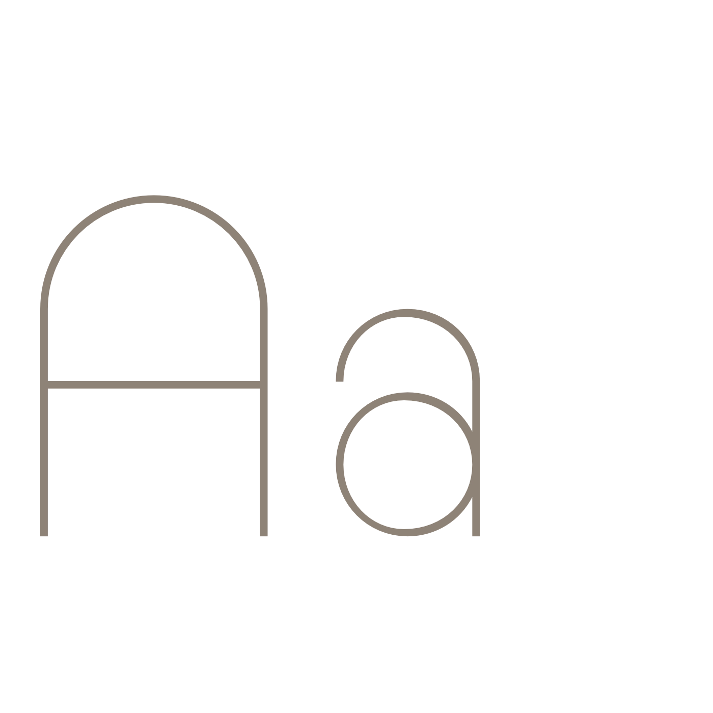
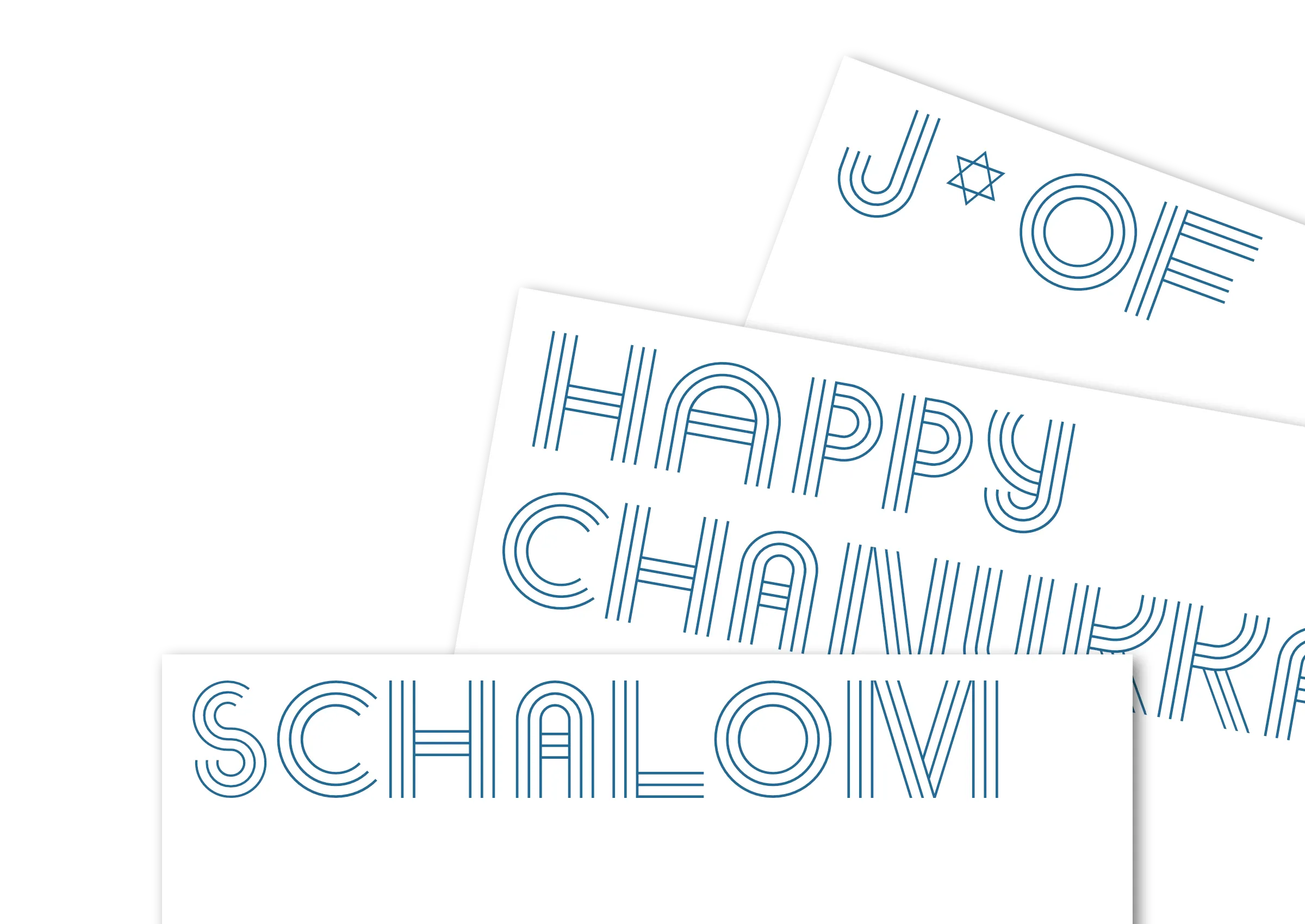

In a detailed briefing with the board member Henryk Fridman, responsible for technology in the community, we created »DAVID« – an exclusive, two-layered type system usable online and in print.
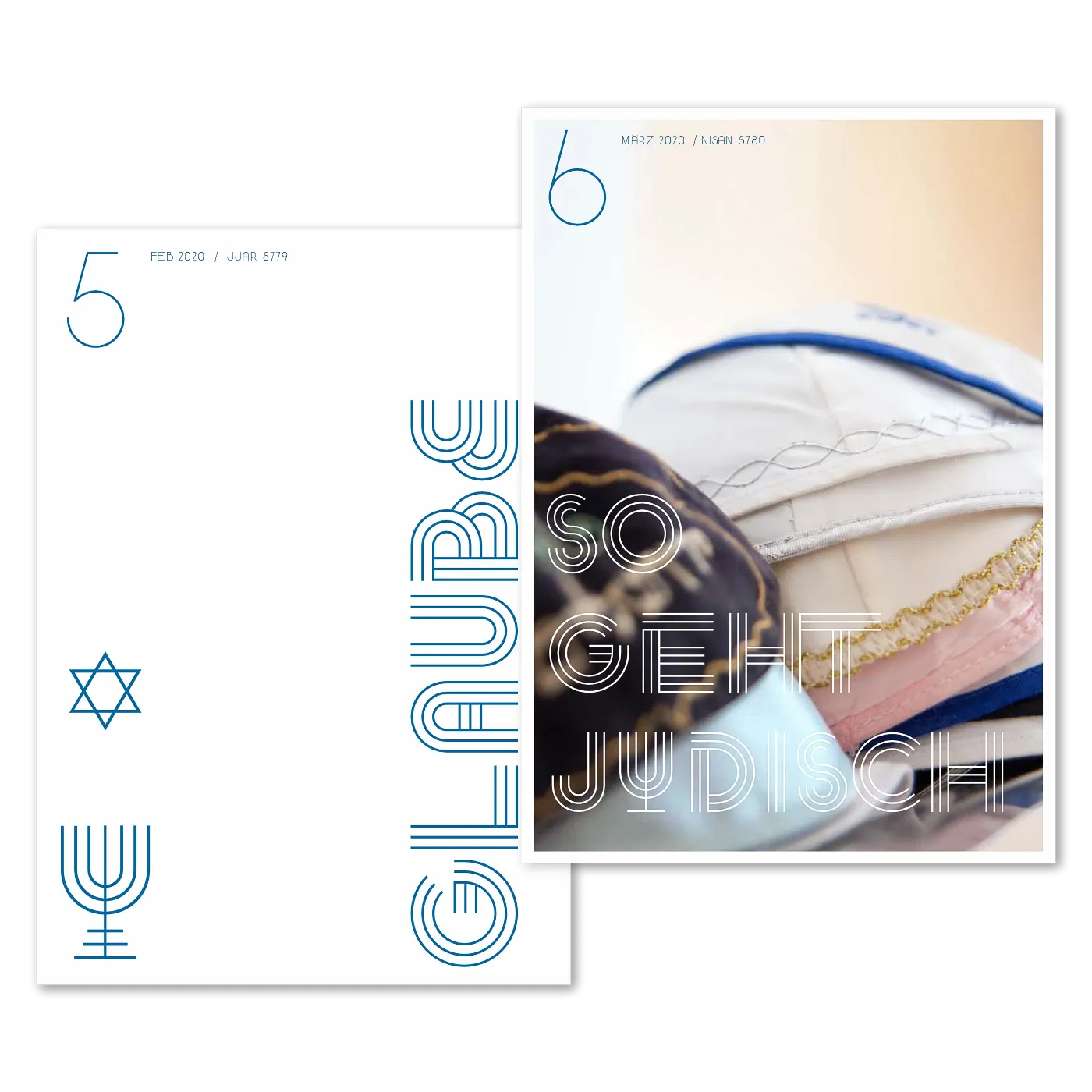
The type concept is deeply rooted in Jewish tradition and values. Early sketches by the Jewish type designer Berthold Wolpe, who fled Offenbach during the Nazi era, strongly influenced the design. The DAVID type system translates traditional values into a contemporary visual language.

The final element of the design draws on the Menorah to develop a unified grid, serving as the structural foundation for all glyphs in both headline and text versions. The result is a harmonious aesthetic giving the typeface a distinct Jewish identity.
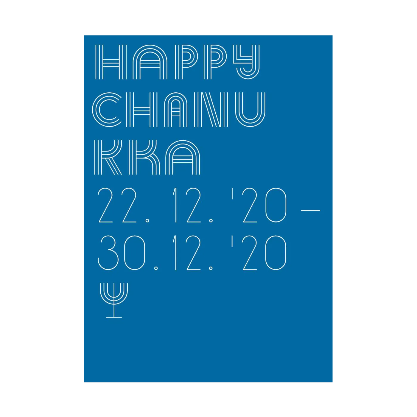
In print, refined typography stands for precision, expression, and conviction. Letterhead and business card layouts follow a clear design grid, balancing white space, typography, and symbolism. Posters highlight the expressive character of the typeface, acting as both an information carrier and design statement.
Client
Jüdische Gemeinde Offenbach am Main K.d.ö.R.
Project Board
Henryk Fridman, Board Member JGOF
Marcus Hein, Design Direction
Development
Corporate Design, Type Design, Web-Design, App-Development