Web & App Design Development
Driving digital transformation for future brands

Project description:
More options - more solutions?
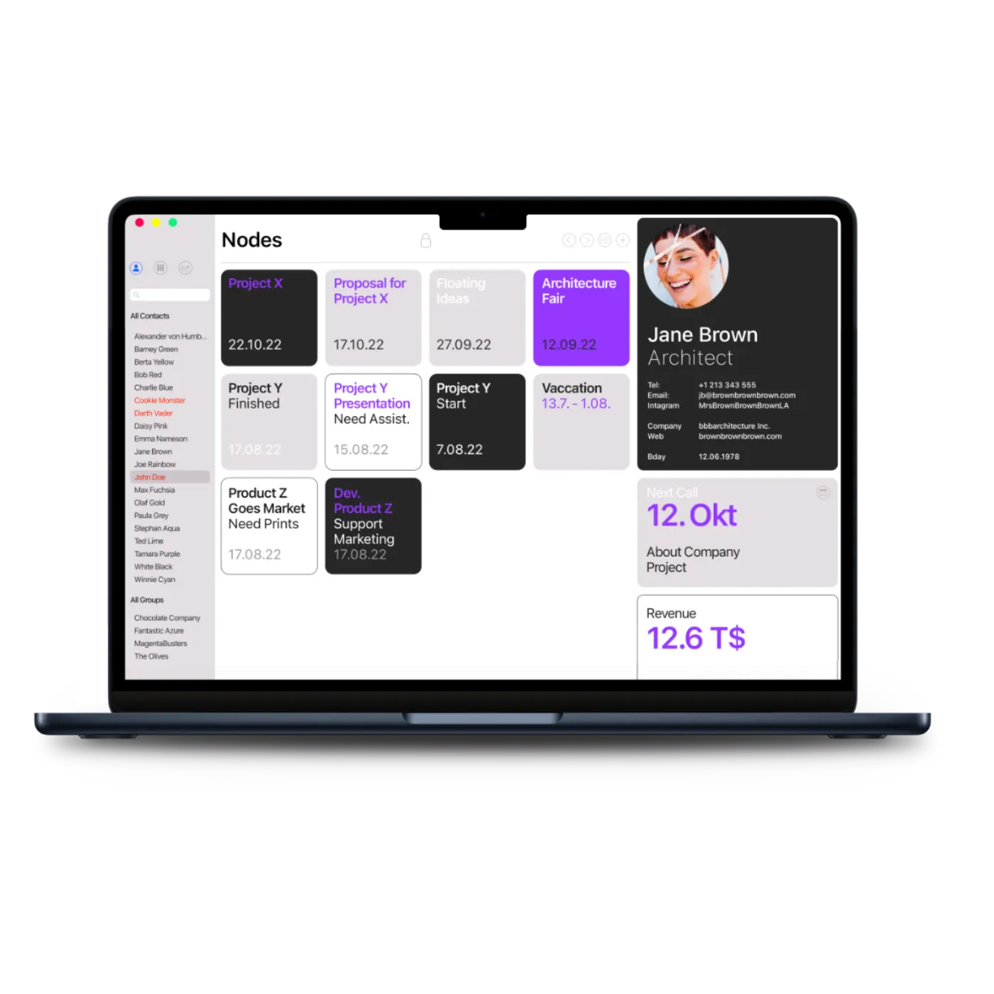
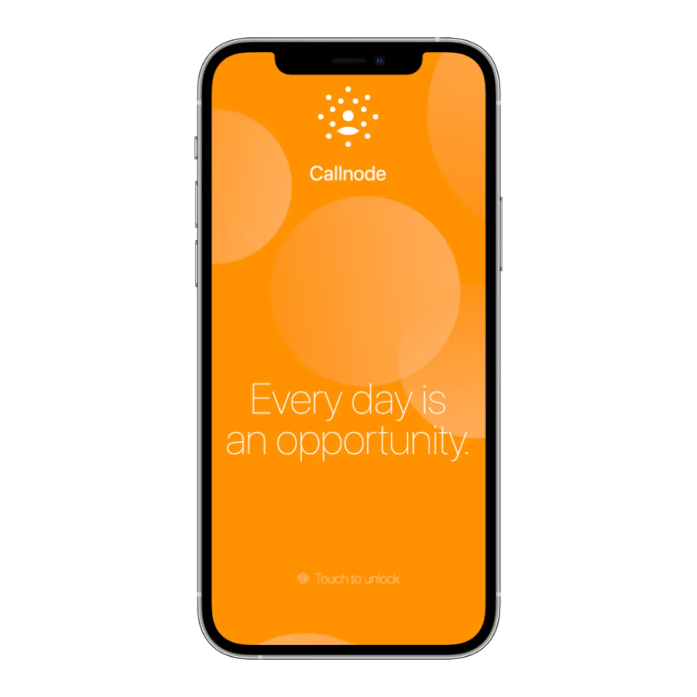
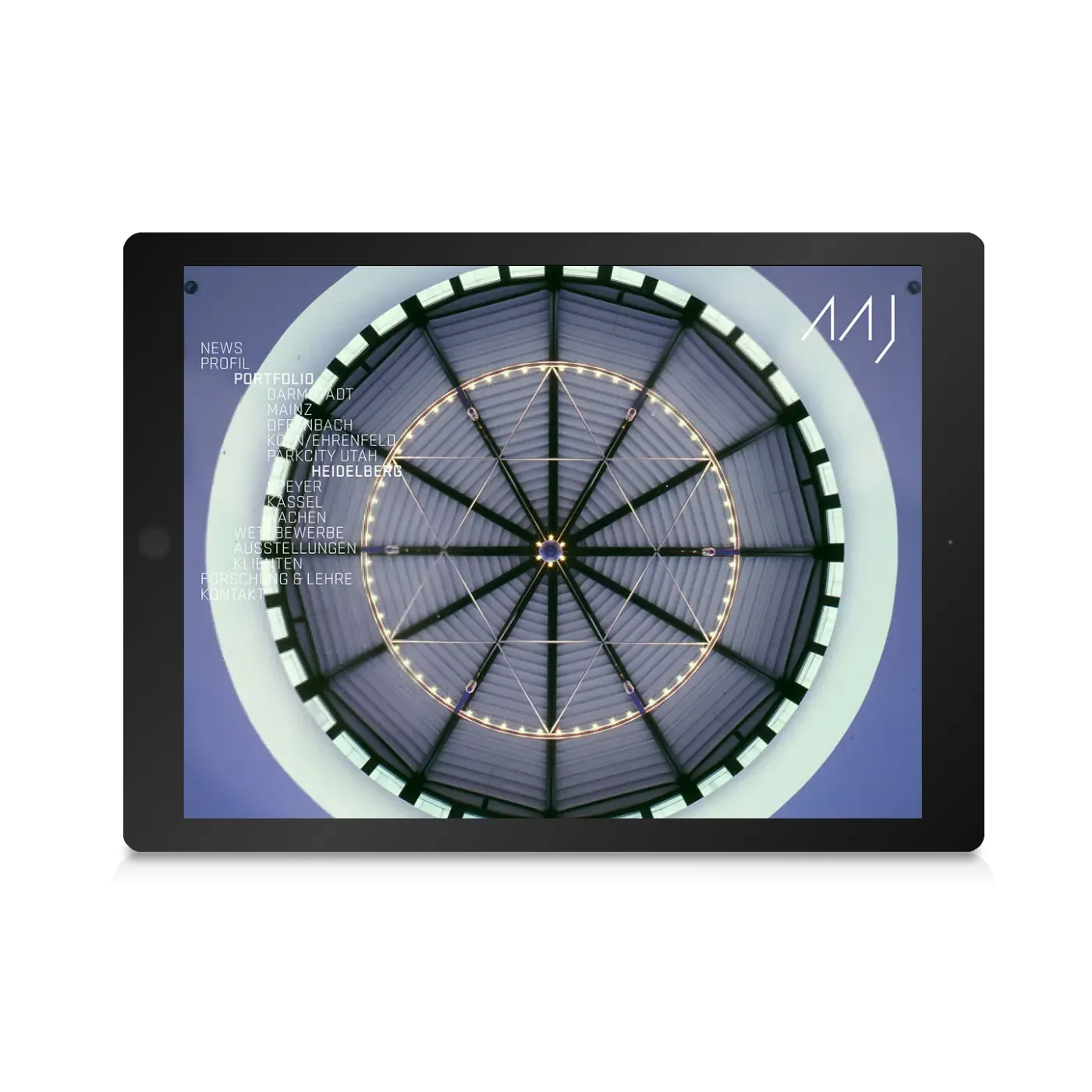
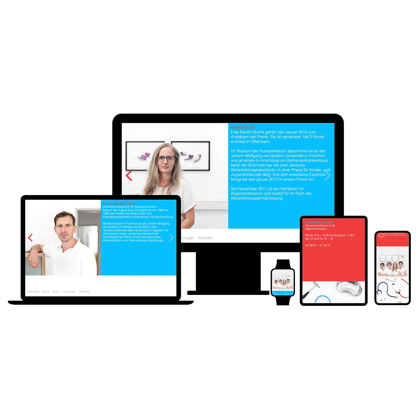
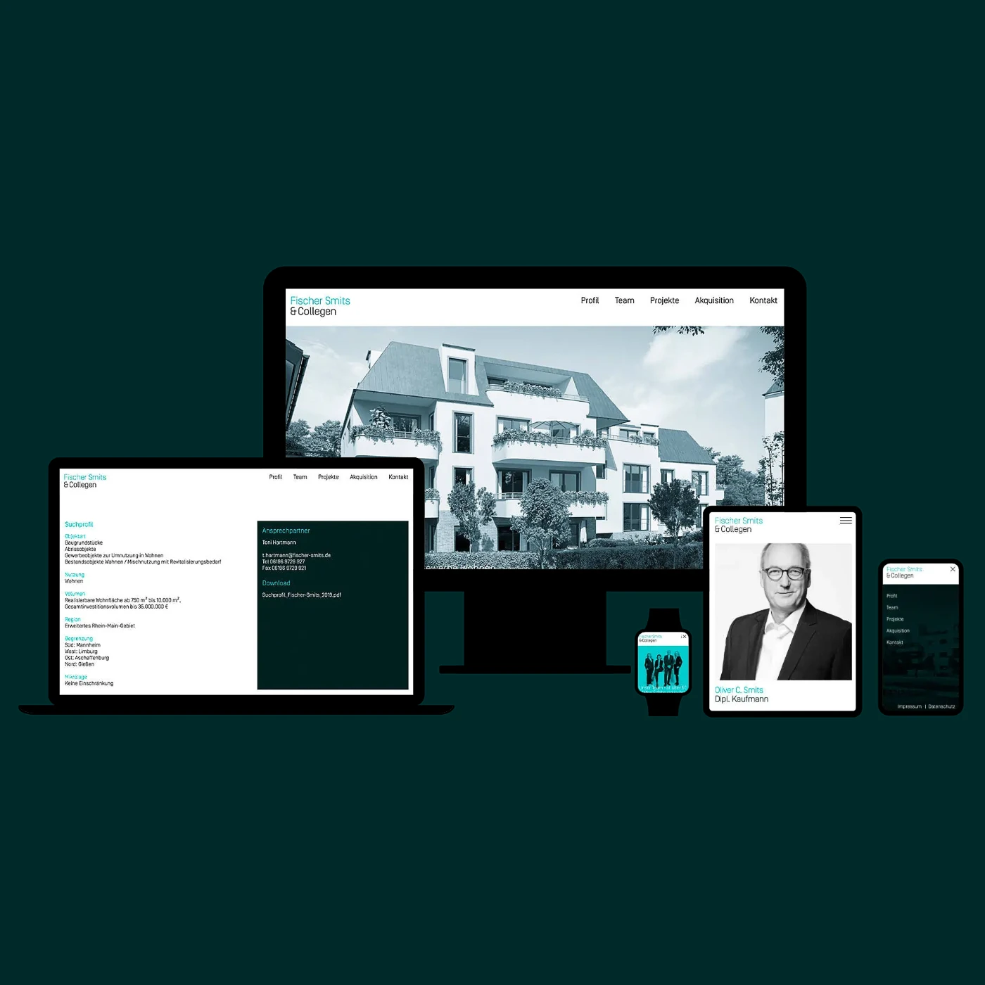
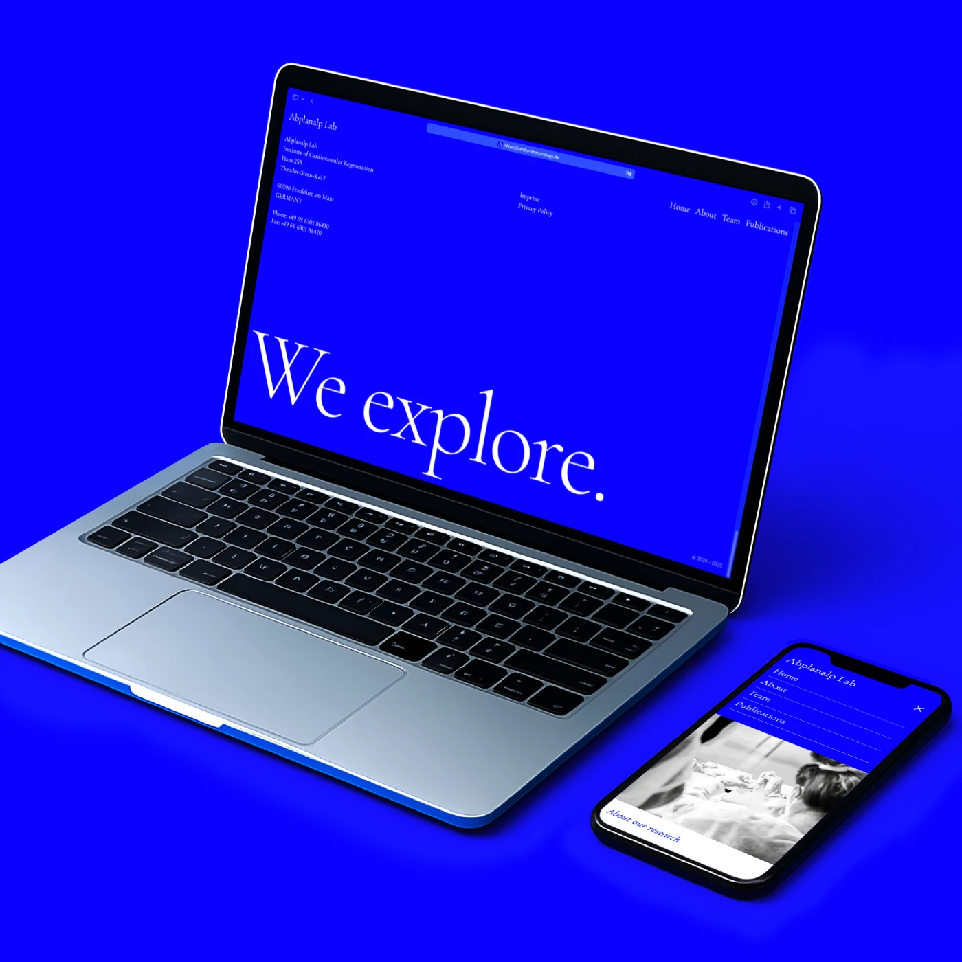
Paradigms used in science help us to organize information and to understand our world. They affect the way we humans design, record and interpret our experiments and observations. Responsive design is one such paradigm for developing websites and apps in such a way that they can react to the properties of the device used, especially smartphones and tablet computers.
The graphical structure of a "responsive" website is based on the requirements of the respective device with which a website is viewed. This applies in particular to the arrangement and display of individual elements, such as navigations, side columns and texts, but also the use of different input methods using the mouse (click, move over) or touchscreen (tap, swipe). The technical basis for this are the newer web standards HTML5, CSS3 (here in particular the media queries) and JavaScript.
With this structure we combine valuable content with coding in order to develop emotional experiences and / or convey information in a modern way. We offer you outstanding design and help you publish your content online.
Client
Various Projects
Development
Web Design, Graphic Design, App Design & Development